Marketing Manager
& Content Strategy

All of them have grown their companies by a lot.
+270% YoY
Net-New Buyers
3,664 → 13,544 unique buying accounts.
Domain Rating
+16%
Repeat Customer Revenue
From $63,600 to $73,600 per month.
7% → 23%
Loyalty penetration
Members visit 4.4× more often than the average customer, ~7,600 loyalty visits a month.
+21%
Q1 2026 vs Q1 2025 sales
82% of post-rebrand customers were entirely new to the brand.
−55%
Reduction in cost per lead
Interested in more business acronyms?
Check out my marketing agency for business inquiries


TRIO's original website and branding was essentially a basic online shop for loose parts.
The Story: TRIO sells proprietary Starlink mounts that keep Starlinks secure while in motion or in place.
Their first mount was born by request from a previous client in a previous RV-remodeling company; this customer was sick of setting up their Starlink everytime they parked. TRIO 3D-printed a solution, patented it, and (somewhat accidentally) iterated it into new, successful company.
TRIO needed to brand this idea, so they came to my agency. Yet while the average person thinks branding begins by making a logo… a logo is actually where it usually finishes.
In TRIO’s case, they only had a competent logo (plus a successful product), and they loved it! This meant I needed to backwards engineer meaning from existing visual elements, while still providing TRIO a new visual language that could distinguish and legitimize their brand.


The first thing I noticed during the research phase was that TRIO had spawned many competitors. What TRIO and these other companies mostly had in common was they mostly presented their products as electronics equipment. By and large, they had a collective web-presence which felt like this: warehouse stock inventory, complex, sterile.
My brain could barely keep attention. To change this, I took inspiration from other famous third-party accessory makers, and even generic-brand playbooks; I wanted to tie TRIO’s image to the brand they develop accessories for so closely, their brand would give people the same feelings as Starlink itself.


We ditched the cold “tech parts” vibe of their old site and co-opted the expansive photography style that's prevalent in Starlink’s brand. Leaning into original photography instantly gave TRIO an adventurous spirit, and infused them with outdoor lifestyle conventions of car and truck makers.


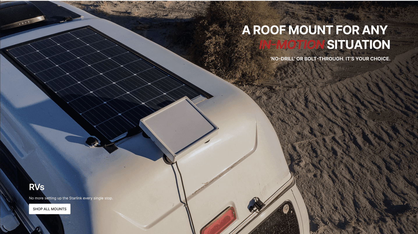


This redesigned web experience captured the feeling of uninhibited connectivity, which is what TRIO's products allow for. (Of course, my team transcribed these elements into a professional Style Guide: official colors, fonts, and design motifs.)
They also needed a consistent voice to speak with. We surveyed their customers, and the data strongly reflected an audience that was highly purchase motivated, “just-make-it-work” types, all simply caught in the same dragnet of Starlink pain points.
With that in mind, after heavily considering hundreds of potential words, I came up with a set of adjectives I felt would assure and empower their target demo.


