Art Direction

I make boring
things exciting.
Some Editorial Illustration I’ve Art Directed


Sample of the sketch phase of editorial illustration

"How To Move With Weed"

"Study: The Best Towns For Working Remotely"

"The Best DIY Projects For Your Starter Home"

"Moving Statistics Report"

"Here Are the Most Common Home Pests"

"The Things You Can't (Legally) Bring to Texas"

"The Things You Can't (Legally) Bring to Florida"

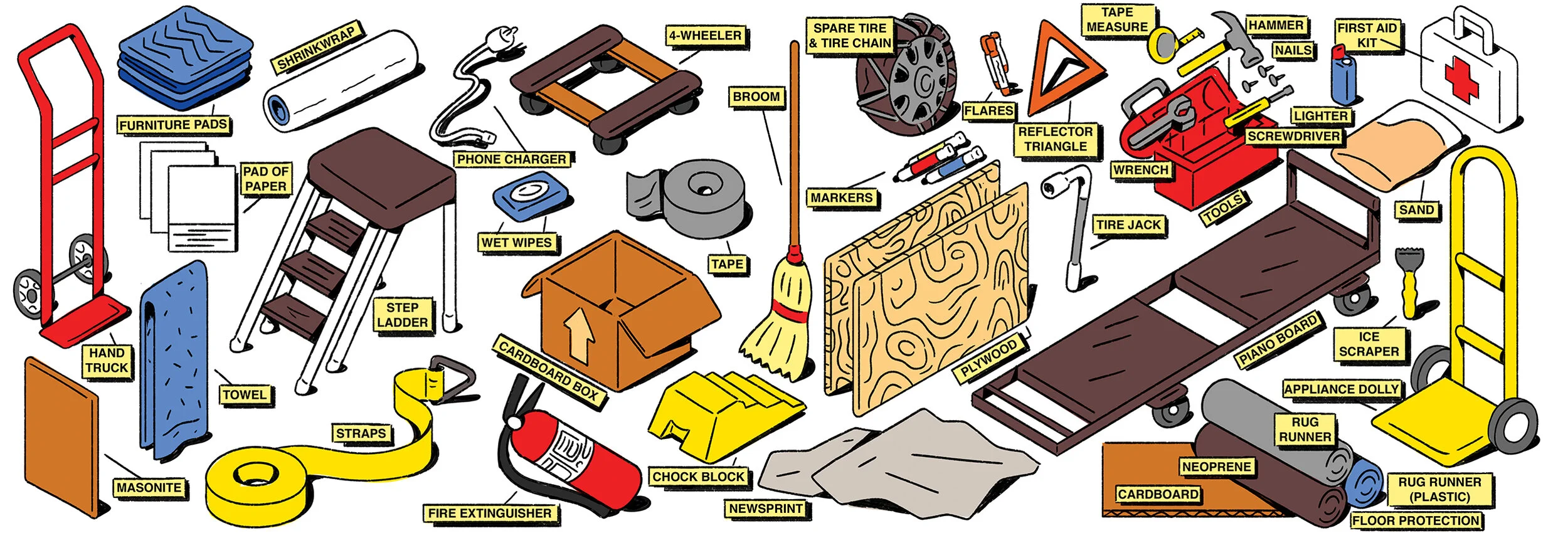
"How To Move a Piano"






"Real Estate: America's Most Haunted Properties"

"How To Deal With Moving Scams"

"Study: Porch Pirates on the Rise"






"Left on Read: America's Most Unreachable Cities"


"A Look at the Biggest Wave of Retiree Moves in Three Years"

"Study: Where Are Retirees Moving?"

"The Cities Where Debt Collection Is Surging"








Jen Hatmaker's "Awake!" Coffee Campaign

HireAHelper
Corporate Branding
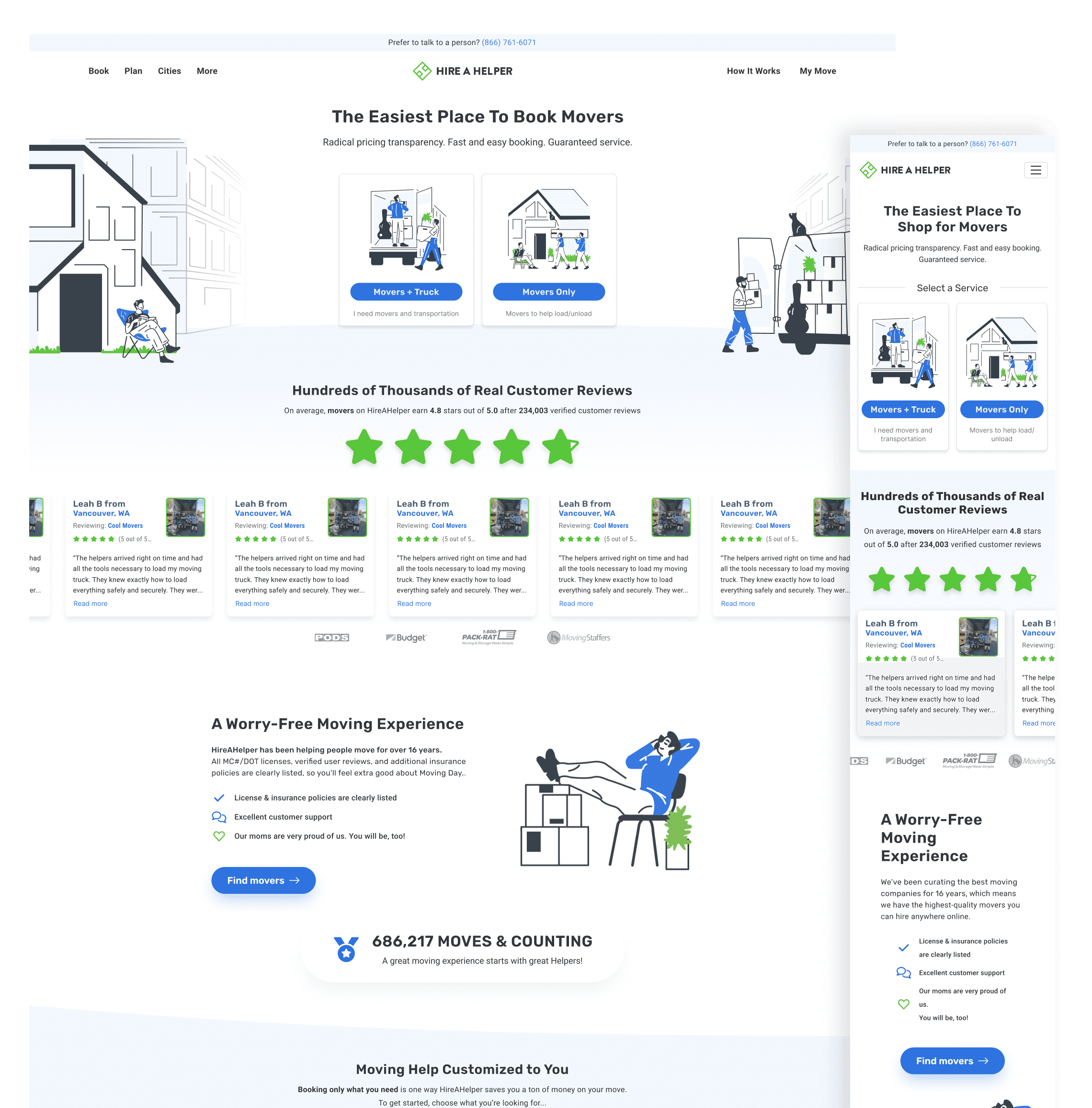
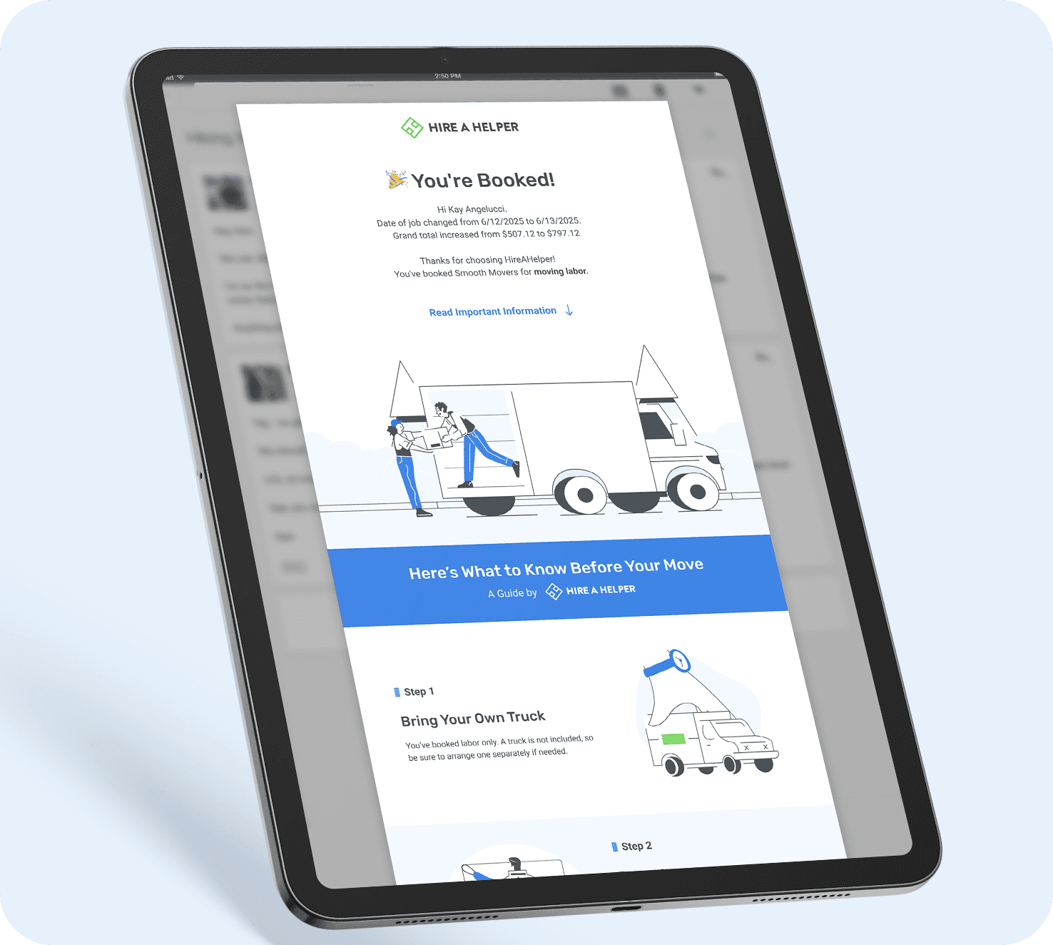
For almost a decade, I helped conceptualize and guide the visual language of HireAHelper.com, the largest online marketplace for movers.


Case Study: The Migration Report
The Project:
The problem Moving titans-of-industry with over 100 years of history conquer yearly news cycles; van lines release “Top 10 Destinations” press releases that news outlets uncritically treat as authoritative.
The plan Strip ancient companies of their authority by creating a web experience that’s engaging top-to-bottom, fueled by far more generalizable data, all communicated through thoughtful art direction; win the conversation and make our company a nationwide authority in the process.

The original Migration Report from 2018 featured stock photos and was made in one day, a proof-of-concept for what was to come.
The Story
I marketed within the the home & moving industry for eight years. At HireAHelper, one of the biggest challenges I faced was the word “moving” meant something different to everybody. This made talking about moving difficult, and data analysis impossible.
Case and point: the government counts a “move” when there’s an official change of address. Giant van companies count a “move” when someone pays them thousands of dollars to move them. Movers count a “move” when someone pays them for labor.
U-Haul counts it as a “move” just for renting a U-Haul. Who is right!?
As far as local news was concerned, brand recognition was right; when big companies released their “reports,” the news treated them as gospel truth. Yet I knew their data was heavily skewed by the demographics of the people who buy their moving services, a smaller, affluent population.
Armed with tons of proprietary data for moving labor, a baseline understanding of statistics, and a couple of developers who were far too game, I set out to personally write and art direct a report that would beat U-Haul and others at their own game.
I honestly didn’t think we’d wrestle away their authority so fast. While the first years were a decent proof of concept, 2020 was a year tailor-made for a breakthrough report. How many people move during a pandemic?
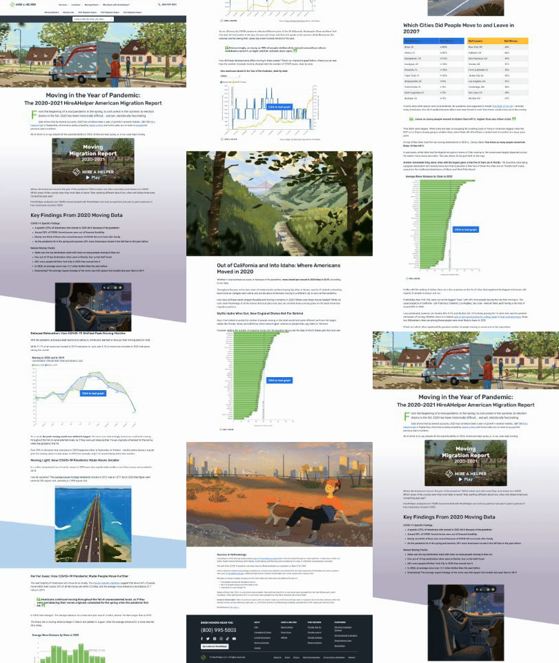
I was lucky enough to work with a phenomenal storyboard artist named The-Long Ly. We designed the report's URL to unfurl migration data down the page alongside illustrations of a fictional person and their dog moving cross-country in a moving truck, depicting a scary time when people weren't going outside.

The-Long Ly

The-Long Ly
The final product looked incredible, and garnered dozens and dozens of placements. We followed it up the following year with — and I still can’t believe this— a webpage designed entirely from photographs of real-life cardboard.

Kezia Hulse
I stumbled upon Kezia Hulse online, a 3D artist who designs scenes with tactile paper. I couldn’t say no to the idea in my head of marrying her style to our Migration Report, but I’ll admit, after we began, I encountered a bumper crop of new-to-me challenges in art directing: “How do we properly light scenes?” “Do I bill per final photograph, for materials, or by hours spent gluing?” “Can the dev team transform photographs of torn paper into section breaks, and for every screen size?”



Kezia Hulse
Kezia and the dev team came through as if they had done this millions of times before. That year’s Migration Report received even more and bigger national placements than the years previous. (Check out the full report here, it's wild.)
Future reports would go on to utilize digital 3D art, traditional illustration, and more. Maybe best of all, the original data we had been creating for every report was being aggregated onto an SEO-led “Moving Statistics” URL, which garnered countless citations year-round, including from “.gov” websites! (This helped raise our site's domain authority a lot.)
I’m still proud of that mighty team of half a dozen people. They stole the spotlight away from giant corporations through sheer talent, and they enabled every dumb idea I had.